Demo Articles

RokTabs is a tabbed content module, standalone and themed. Content is transitioned, either by fade or scroll, powered by Mootools, which can be automatic or manual. Plugin support is also featured, whether loading module positions, read more content, or the K2 CCK component.
Module Features
- Tabbed Content: Display multiple content items in a tabbed enclosure.
- Module Position Support: You can insert module positions inside the tabs.
- Inbuilt Styling: Both light and dark styling for standalone support
- Configurability: Highly configurable from options dealing with transition, to content type and layout.
- K2 Support: Fully compatible with the powerful content constructive component K2.
Module Configuration
Options available at Admin → Extensions → Module Manager → Roktabs Module. Important demo settings are highlighted accordingly:
Other
Joomla Core Content
Content Parameters
Animation and Styling
Subtract roktabs-links margins needs to be enabled for best visual effect with scrollable tabs.
Tab Details
Autoplay Settings

RokNewsPager is an article previewer and rotator. It displays content articles, in a summarised form and, using mootools based javascript transition, rotates through a series of pages displaying articles in a contracted list format.
RokNewsPager allows you to display a large number of news items and links in a small compact area via its paging functionality and includes a multitude of configuration options and parameters to customize how your news is displayed.
RokModule needs to be installed if you are using this module within Joomla 1.5.x
Module Features
- Javascript Transitions: using the power of mootools, the module fades between lists of your content articles
- Previews: set the number of characters you wish to display from your articles
- Section Control: choose all articles, or those from particular sections or categories
- Auto Update: select whether the module auto-updates using AJAX
- K2 Support: Fully compatible with the powerful content constructive component K2.
Module Configuration
Options available at Admin → Extensions → Module Manager → RokNewsPager Module:
Other
Joomla Core Content
Content Parameters

RokStories is a great module to display your articles and accompanying images as a featured item. The module itself is facilitated by Mootools to transition between images and articles seamlessly. Perfect for showcasing featured articles or image on your site.
Module Features
- Content Transition: The module transitions through content items, whether they are full text, a single image or combination of both.
- Article Controls: Advanced selectors for content, choose from categories, sections and authors and control the order.
- Customisable Opacity: Thumbnails can be set from transparent to opaque
- Navigation Interactions: Parameters to set whether to change news by clicking or hovering over the thumbnails
- K2 Support: Fully compatible with the powerful content constructive component K2.
- Standalone Styling: Inbuilt theme allows the module to be used on any site.
Module Configuration
Options available at Admin → Extensions → Module Manager → RokStories Module:
Other
Joomla Core Content
K2 Content
Content Parameters
Additional Showcase Layout Content Parameters
Dit artikel moet nog geplaatst worden, sorry voor het ongemak.
test

RokGallery is a ground-up revolutionary gallery extension, developed to be hugely flexible, customizable and thus extendable far into the future.
Description
The system itself is built on a custom tag-based architecture with the ability to have multiple tag-based galleries. RokGallery uses design and concepts that have been traditionally reserved for platform-native applications and are for the first time making their way into a web environment. For example, you will not have to resize images, or make thumbs before using them in RokGallery, just upload the raw image and use the RokGallery slice editor to resize and crop the images. This non-destructive editing method allows you to create and edit your image size, cropped view, etc, at any point without having to reupload or recreate your image in external photo editing software.
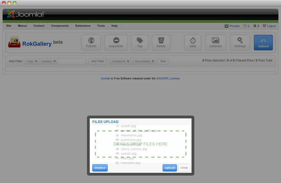
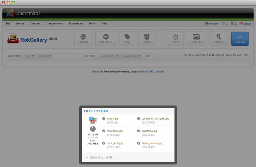
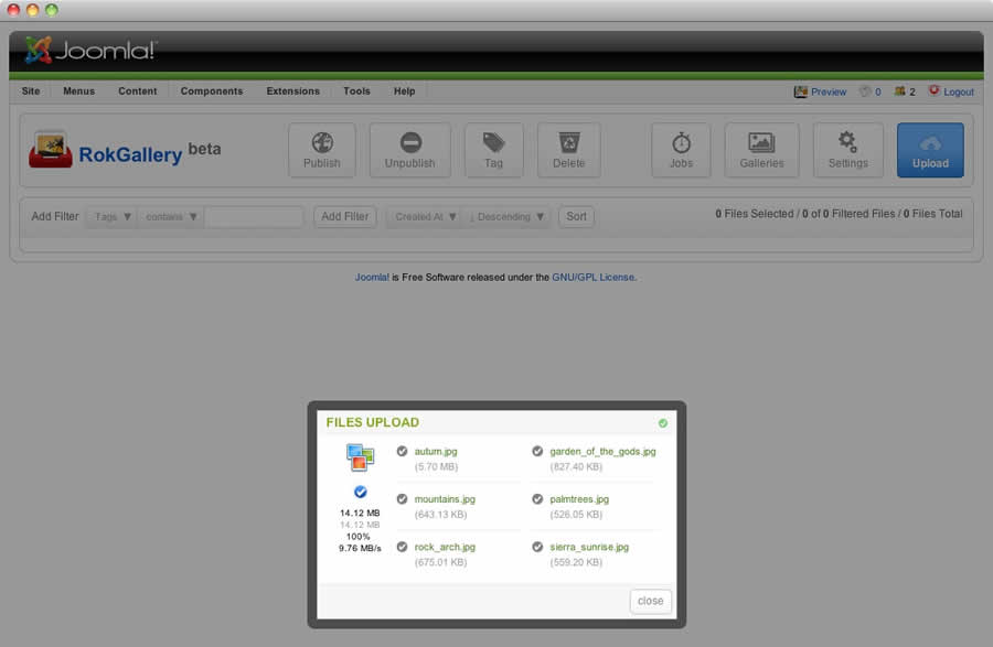
Other features include an all-new multi-file image upload mechanism that incorporates the latest HTML5 drag-and-drop upload functionality, but can also fall back to Flash if your browser doesn’t yet support this feature. Compound filtering can be used to isolate specific images you are looking for and a sophisticated Jobs Manager handles processes like image resizing in the background so you can get on with your work without having to wait for time-consuming image computations to complete.
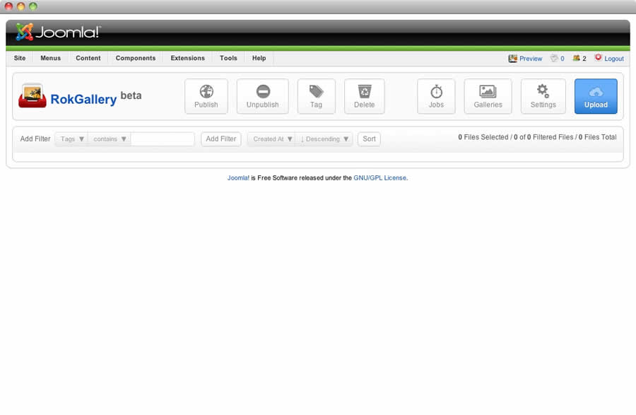
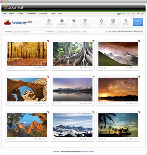
Access the RokGallery Component at Admin → Components → RokGallery
This section is an introduction to the general interface of RokGallery, specific instructions on the functions, such as filtering, will be explained below.
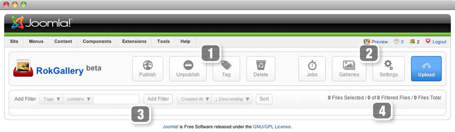
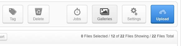
#1 Image Controls
#2 Gallery Controls
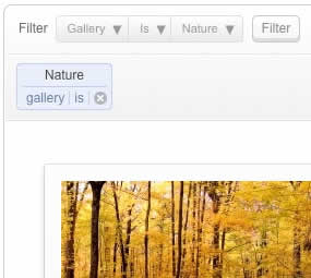
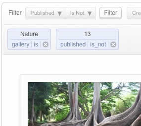
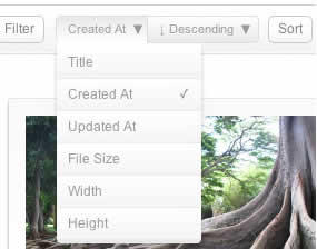
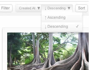
#3/4 Filters
The filters have a range of variables such as gallery, file type, published etc... to allow you to sort your images for management in an efficient and simple manner. Statistics for the filters appear at #4.
Photo Upload
RokGallery uses a HTMl5 file uploader, or Flash for unsupported browsers.


Gallery View and Jobs
All photos will appear at Admin → Components → RokGallery. RokGallery has support for multiple image selection, either by drag and highlight with the cursor, or via individual selection with the Shift Key and click.

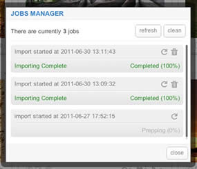
Jobs Manager
The Jobs Manager provides you a log of operations undergoing or undergone in RokGallery. You can view:
Galleries Manager
RokGallery is a tagged based gallery component, therefore, Galleries are controlled by tags and not specific photos in albums. Subsequently, you can easily have one master photo in multiple albums with ease.
A single image can appear in numerous galleries based on its tag, and also can be different sizes based on the gallery settings, without editing the original image.
Remember to Publish a Gallery after clicking Save. If you make any changes to a Gallery, whether in the Galleries Manager, or in the Image Slice Editor, you will need to re-Save in the Galleries Manager for the changes to take place on the site.
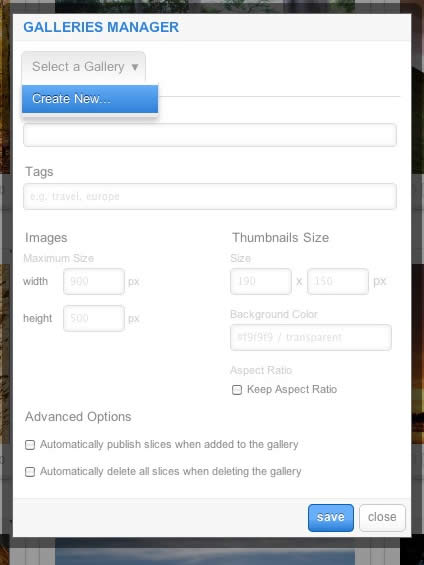

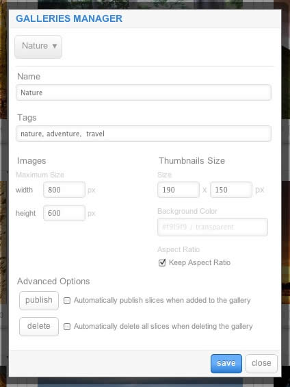
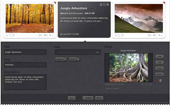
Image Editor
RokGallery has a very advanced image editor, akin to a native application. The various parts will be discussed below.
After selecting the edit button, you will be able to edit the META data of the image, the image itself, plus delete or publish the image.
- Title: The name of the image file to be displayed on the frontend gallery
- Slug: The individual identifier for an image (we recommend not to change)
- Description: The description of the image file shown on the frontend gallery
- Tags: Add the tags that you wish to associate with the image
- Slicing: Edit the image
 Publish:Show or Hide an image for specific tags/galleries.
In the Slice Editor, you can edit the META data and the actual image. You can crop the image, similar to that of an native application, with a set or variable marquee, in addition to Zoom controls. Edits in the Slice Editor are on a per gallery/tag basis.
The original image that was uploaded is maintained, as a new image is created after applying the crop. This can be reverted at any time from the Slice Editor.
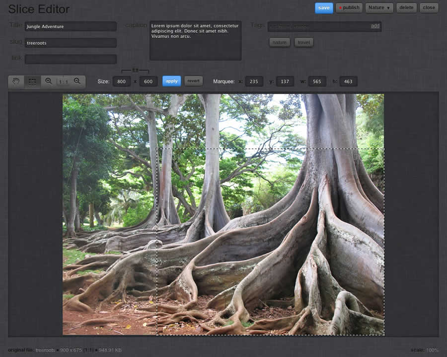
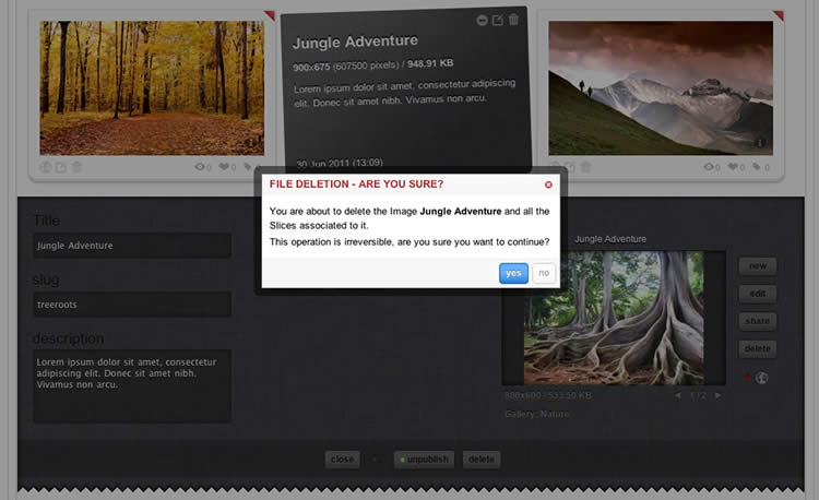
Additionally, you can also Share the slice via the Share button, or Delete the image via the Delete button, from the Image Editor:

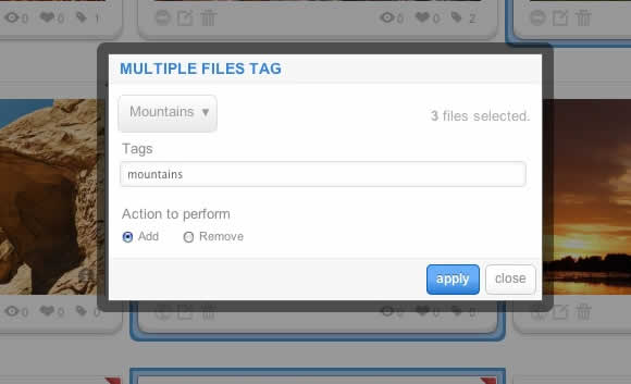
Multi-Tagging
Tagging is at the core of RokGallery, and with its multi-selection ability, you can easily manage tags across multiple images with great ease. Simply highlight several images and click Tags. Here, you can add, remove, or change any common tags applied to your selection.
If you wanted to quickly move several images to another gallery, simply change their tag.
Filtering
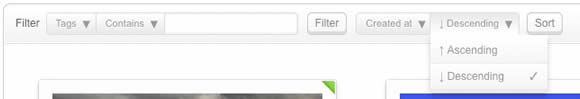
A system based on tagging needs an advanced search facility, so RokGallery employs a simple but powerful filtering mechanism:
Filter Type
Filter Operation
Order by Type (Asc/Des)
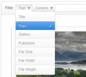
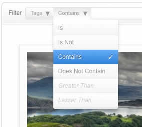
Filters are not singular and can be applied cumulatively: